Mi-mAbs: rethinking and structuring the web experience of a French biotech.
Making a complex technology clear to researchers, partners and investors, with a sober, contemporary art direction.
- Role
- Lead design, art direction, project management
- Client
- Mi-mAbs · French biotech
- Type
- Full website redesign
- Year
- 2025
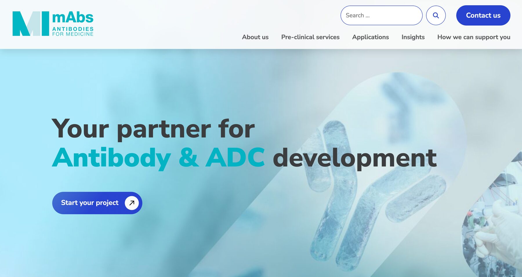
In 30 seconds, if you’re in a hurry
Mi-mAbs, an antibody-based immunotherapy specialist, wants to clarify its positioning and refresh its online image.
Simplify a scientific message, structure the site and build a distinctive identity, for several audiences.
A more serious, contemporary identity, a clearer narrative and better-organised content.
The context
Mi-mAbs is a major French biotech company specialising in antibody-based immunotherapy for scientific and pharmaceutical research.
In 2025, the company wanted to restructure its website experience, simplify its message, clarify its positioning and refresh its image with researchers, partners and investors. I led the project end to end: scoping, stakeholder alignment, art direction, wireframes, high-fidelity mock-ups, iterations and technical specs.
The goal
Several challenges stood out: a technology that’s hard to explain, a poorly structured site, several audiences (researchers, partners, investors) and an identity that didn’t stand out from competitors.
The job was to find the levers to address them, editorially, visually and strategically.
The leversMy role & approach
Lead design, art direction and project management, end to end.
Frame
- Audit of the existing site
- Alignment workshops with stakeholders
Explore
- Competitive review
- Visual directions: moodboards and intentions
Structure
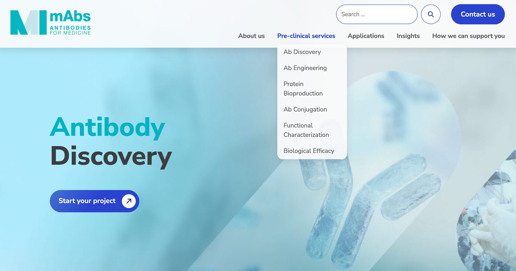
- Information architecture: navigation, menu, hierarchy
- Wireframes
Deliver
- High-fidelity mock-ups and iterations
- Technical specs for the dev team
The outcome
- A more serious, clean and contemporary visual identity
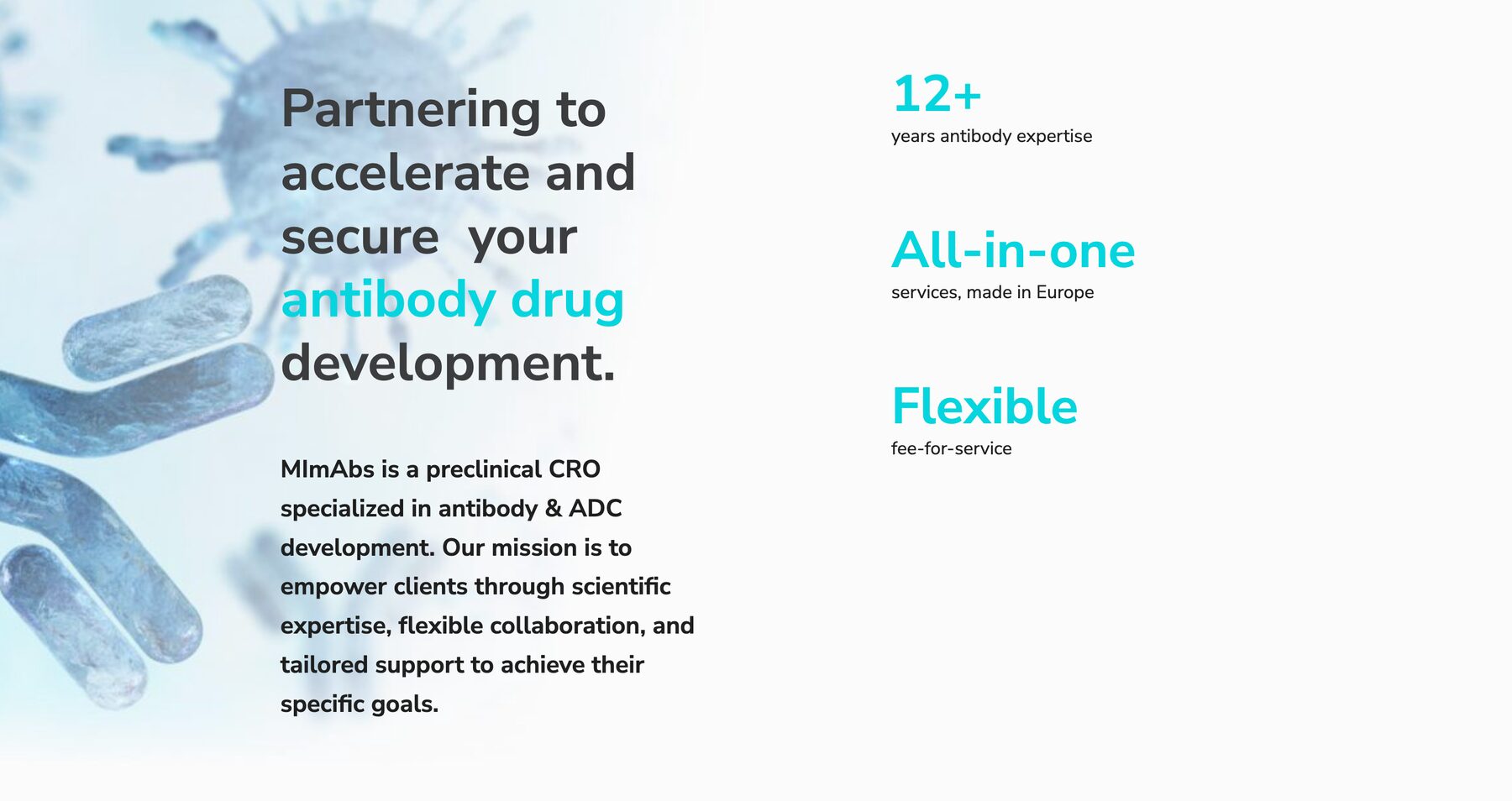
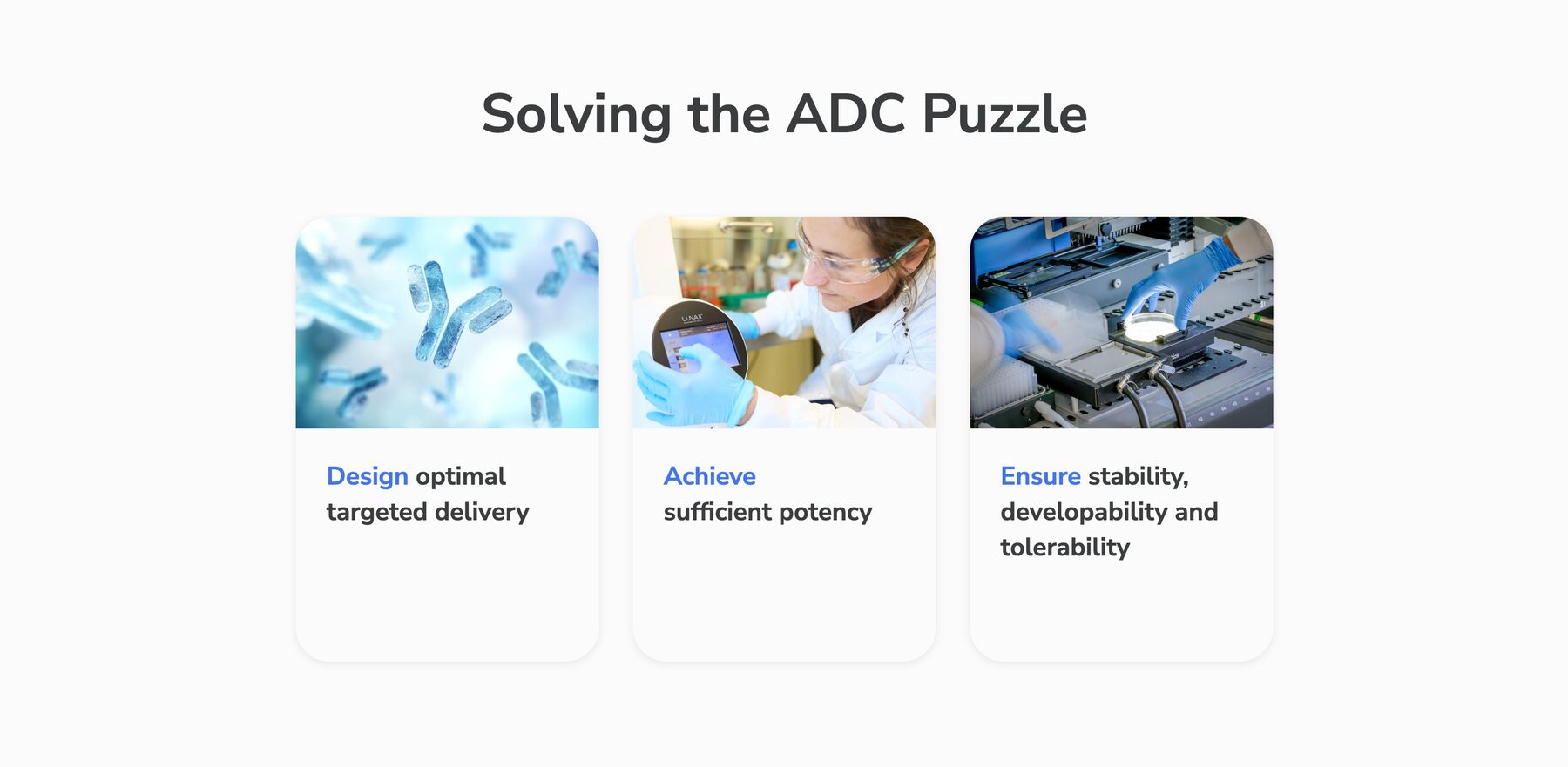
- A digital experience that highlights scientific and technological innovation
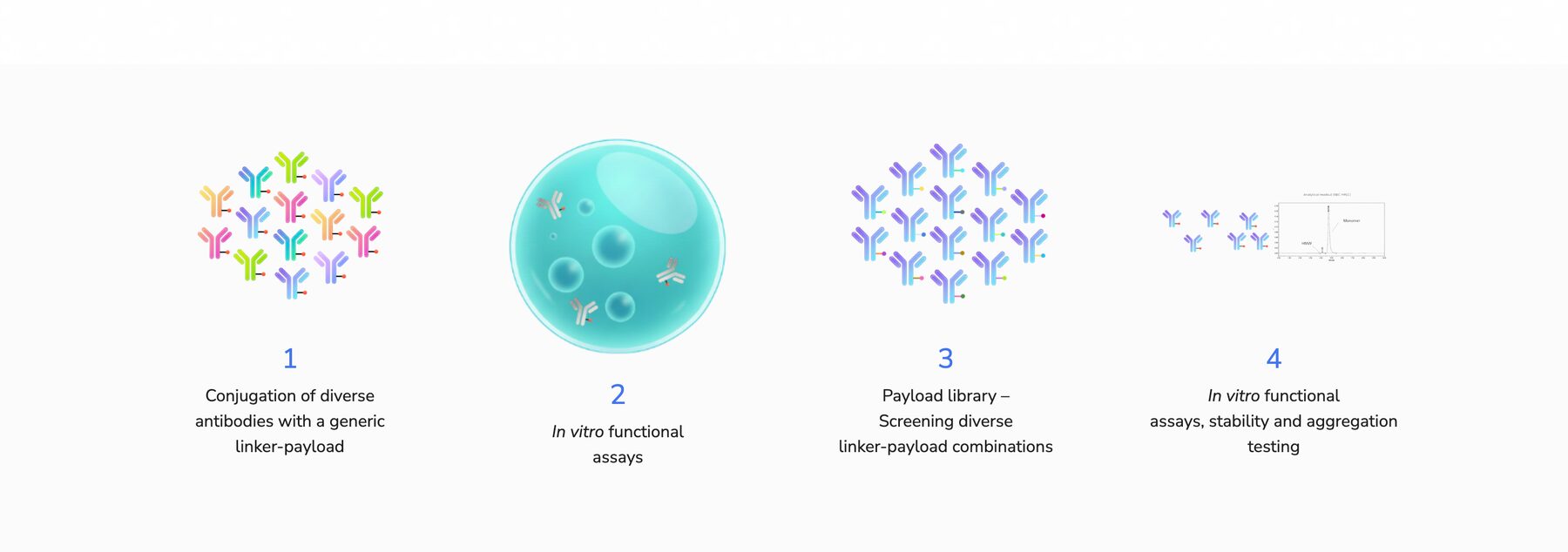
- A simpler, more readable story around the technology
- Better hierarchy for scientific content
- Visitors engaged through a smoother, more immersive experience
What I took away
- Translating and popularising a complex scientific subject
- Designing an experience that speaks to several audiences
- Defining a strong, contemporary identity that serves the message and the users